Mulini Exhibitions
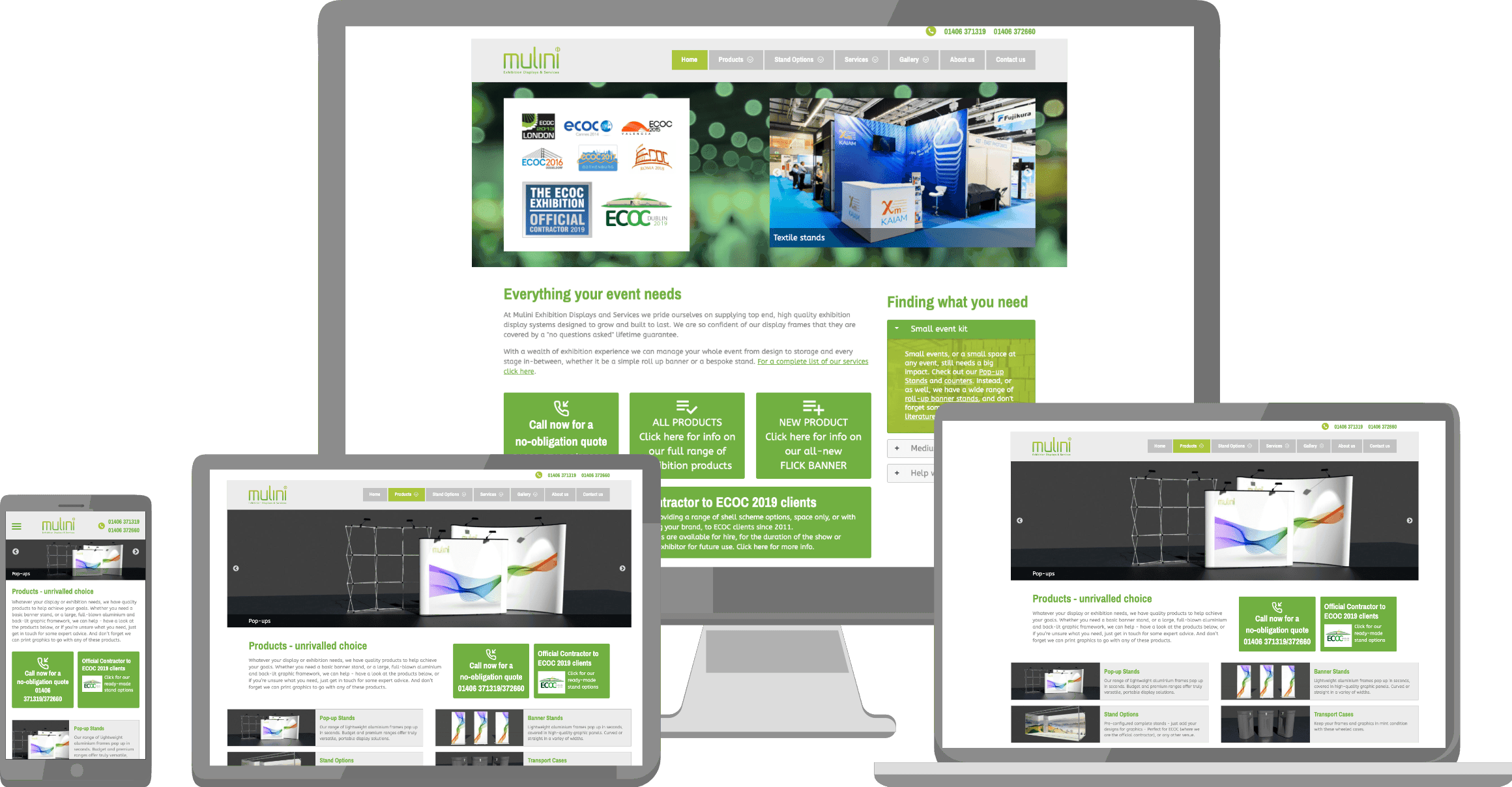
Mulini Exhibitions' website showcases their trade exhibition products and services in a slick professional website design. The mobile-friendly design includes space-saving 'accordion' features.
Tabs are used to display product details simply, without overloading visitors with too much information.
If you need a different configuration of a product, you just click another tab for the specifics.
The site also includes ground-breaking 3d models of stands that can be spun around and viewed from any angle.
Call-to-action boxes are used throughout the site highlighting the important suggested action on a page. The company offers a wide range of products and services, so good navigation was vital, whether viewing from a smart phone or computer, and this was achieved through careful grouping of navigation items into logical sections.
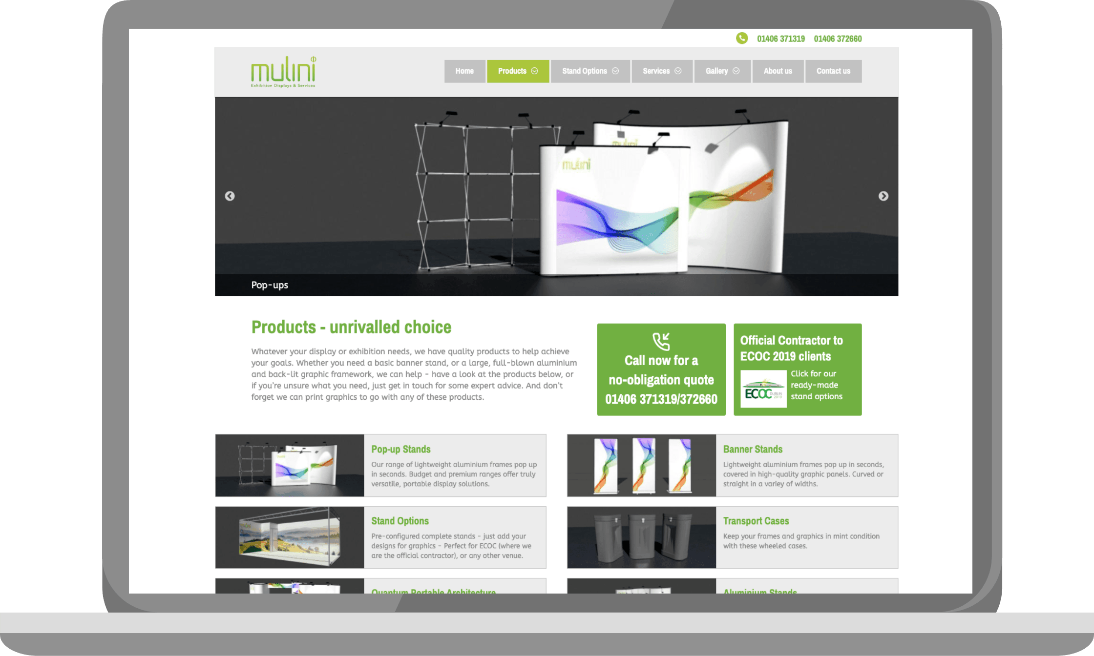
Mulini Exhibitions products landing page with a slideshow header, call to action boxes and short introductions to product categories.
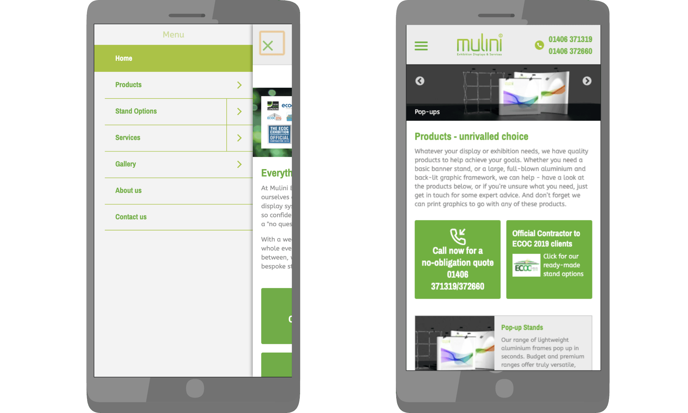
Mobile menu open and closed on a smartphone
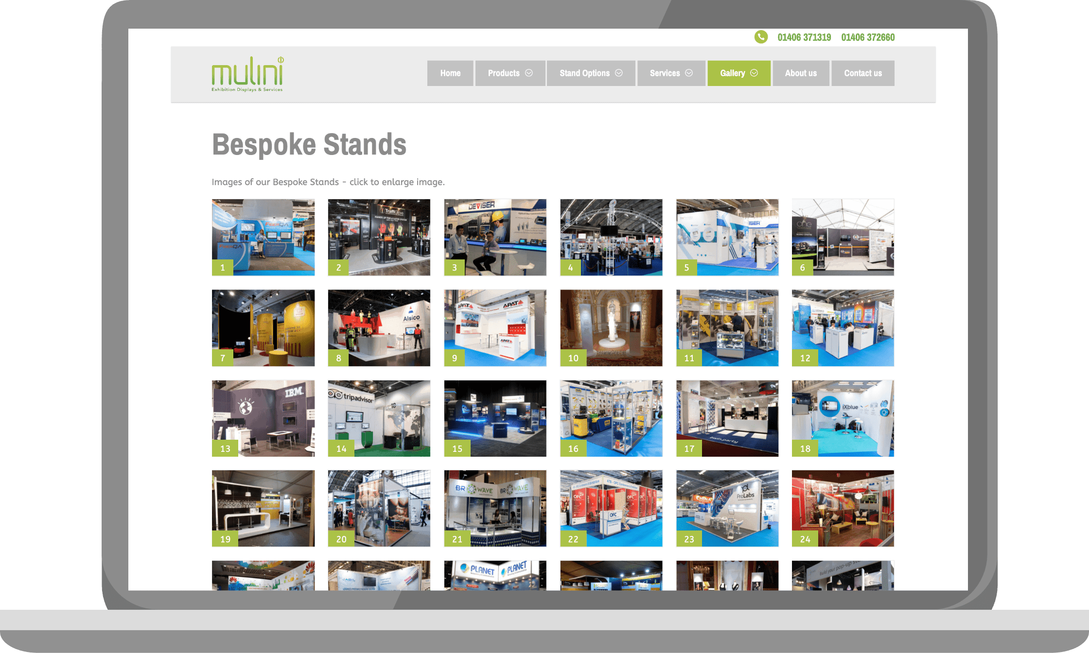
Gallery page of exhibition stands on a laptop, each one pups up at full size when clicked
You can visit the full site here:
Mulini Exhibitions